This was my third consultancy focused on Gaza, and the first of a string of work, still ongoing, working with Oxfam GB and the food sector in oPt.
The evaluation took a detailed look at a small pilot project run by Oxfam and WFP. The local implementing partner Ma’an had generated significant amounts of data through comprehensive monitoring using a range of food security tools, and the report sought to represent some of these results as clearly as possible through charts and graphics.
Timelines can be valuable for identifying potential problems in monitoring, and for placing unexpected results in context.
 These charts, for example present complex data with multiple dimensions comparing two beneficiary groups in digestible ways. Click on the diagrams to see at full size.
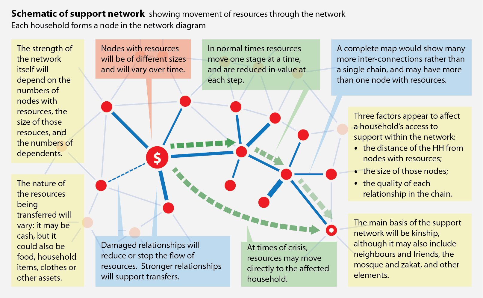
One section of the report sought to describe the relationship between households – the usual focus of humanitarian assistance in Gaza – and the wider family network through which resources like food, clothing and money flow according to needs, availability and influence. Providing assistance at the level of household without understanding the implications of the family support network is bound to lead to unexpected results.
The network diagram below summarised the analysis.
The evaluation report is on the CaLP website, here.

